
Understanding how your projects are doing depends on various factors – such as your way of working, team dynamics, chosen methodology, and a lot more. There are lots of charts out there to show your progress, like Gantt charts, PERT charts, Pareto charts, flowcharts, and many more — but if you’re into Agile, a burn up chart might be just what you need.
But what’s the meaning of this Agile buzzword? In this article, we’ll discuss the purpose and benefits of a burn up chart, why it’s useful, how it’s different from other charts, and how you can understand and make one.
Definition of a Burn Up Chart
A burn up chart is like a map that shows your work progress with two lines on a vertical axis. One line shows all the work planned for the project, and the other shows what’s been done so far. When your project is complete, these two lines come together.
The vertical axis represents the units of measurement. You can use different units to measure, like story points, issue counts or issue estimates. The horizontal axis represents the project’s timeline.
These charts are handy when you’re deeply involved in Agile project management. They give you a quick and easy overview of how things are going.
Burn Up Vs. Burn Down Chart — What is the Difference?
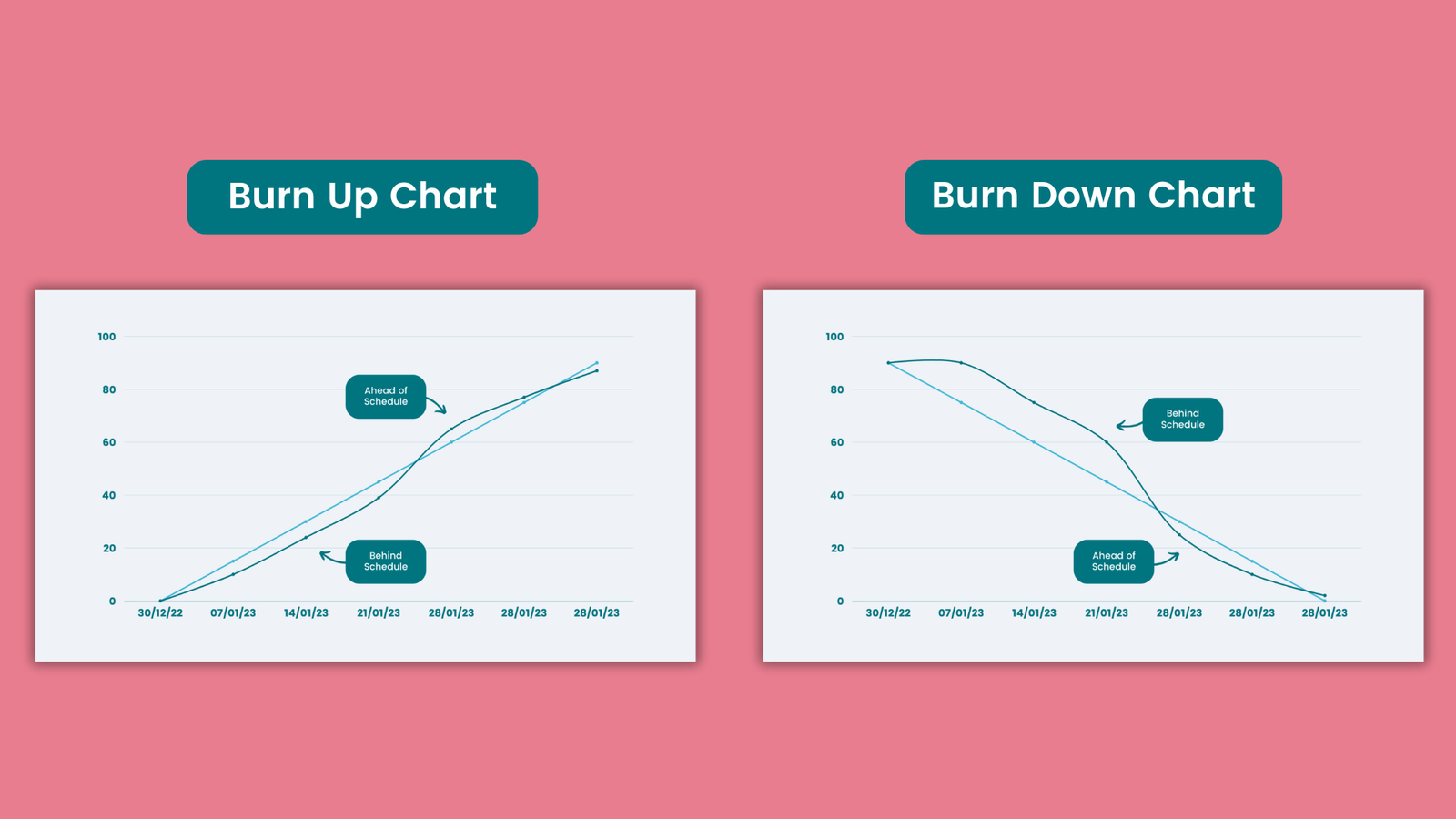
Burn up and burn down charts are both handy tools in project management, showing progress visually over time. But there are clear distinctions between the two.
A burn up chart starts with one straight line representing the total work to be done. Another line tracks the completed work, starting from zero and increasing as tasks are finished.
On the other hand, a burn down chart begins with the total amount of work and tracks the remaining work over time. As time progresses, the line on the chart decreases, showing less work left to do.
This difference means that while a burn down chart focuses on what’s left to complete, a burn up chart shines in showcasing the work that’s already accomplished.
Why Use a Burn Up Chart?
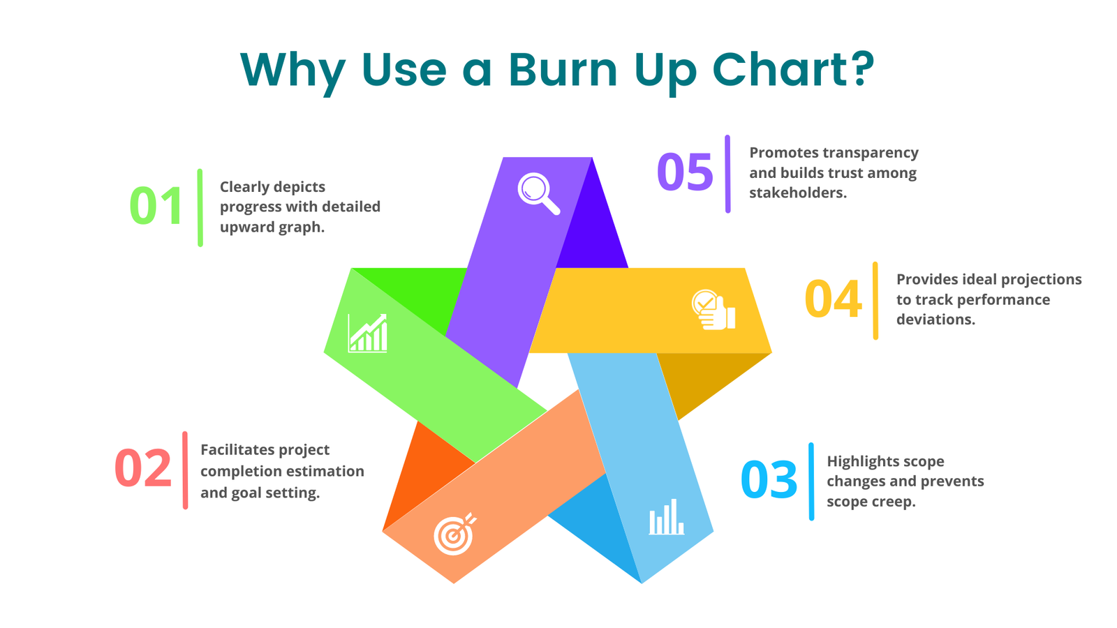
Here are some benefits of using a burn up chart for Agile and Scrum projects:
1- Clearly shows progress: Burn-up charts are less complicated and easier to read. Unlike burn down charts, burn up charts display completed work in an upward graph with more detail, showing both total work and work completed.
2- Help with forecasting: Burn up charts help your team estimate when the project will be finished. By looking at completed work, you can figure out how much more time is needed, helping you set goals for your Scrum team.
3- Spotlights changes in scope and controls scope creep: Unlike burn down charts, burn up charts make it easy to track any changes in project scope. This helps you avoid letting the project grow too big without noticing.
4- Provides ideal projection: Burn up charts provide an ideal projection to monitor deviations from optimal performance, helping you assess your team’s efficiency during sprints and gain insights into their performance.
5- Promotes transparency: Burn up charts are easy to understand and help everyone involved in the project see how things are going. This transparency builds trust, especially when working with clients.
How Do You Read a Burn Up Chart?
Here’s an example of how you read a burn up chart:
Along the y-axis are the units of estimation fields (story points, issue estimates, issue counts etc.) or the amount of work to be completed. Across the x-axis is the sprint number or time period. The orange line across the top shows the total planned amount of work that will be delivered by the end of the project. The blue line illustrates the planned ideal completion of work. While the green line is reporting the actual amount of work completed.
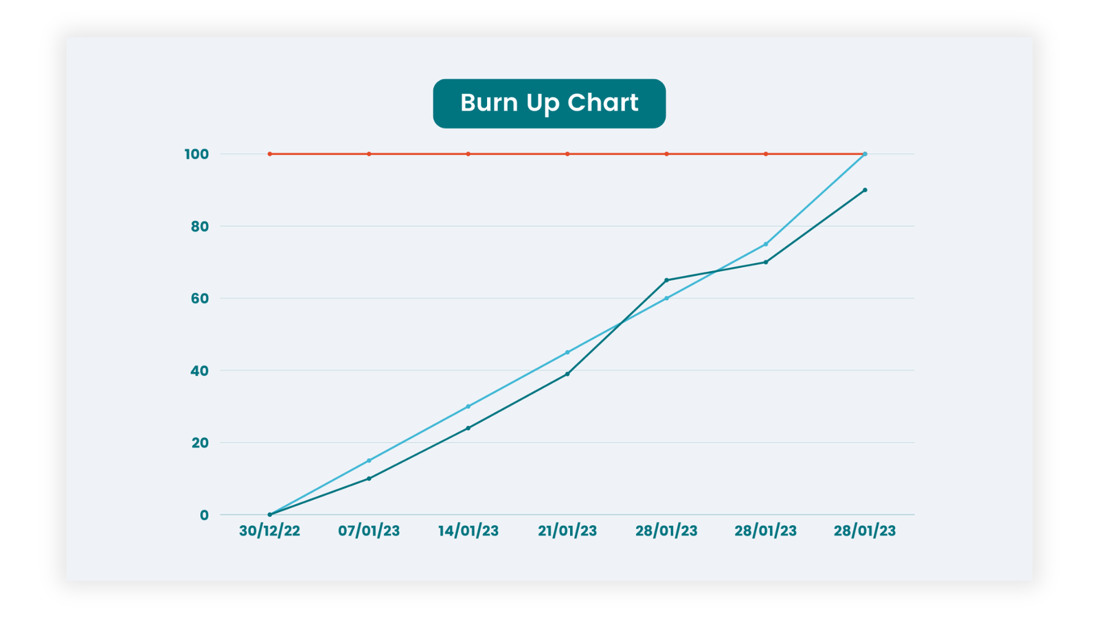
Some key things to watch out for when reading a burn up chart are:
- If the orange line changes, you know work has been added or removed from the project.
- If the blue line changes, a change has been made to the baseline plan for how much work will be completed in each sprint/time frame.
- If the green line is beneath the blue line, you’re behind schedule.
- If the green line is above the blue line, you’re ahead of schedule.
Conclusion:
In conclusion, as burn up charts offer invaluable insights into project progress, aiding Agile teams in decision-making and goal setting, their significance cannot be overstated. Their ability to provide clear, detailed insights into project status, forecast completion timelines, monitor scope changes, and promote transparency makes them invaluable assets for Agile and Scrum projects.
Ready to leverage these benefits for your team? Discover how Khoji’s Burn Up Charts can help your teams effectively navigate project progress.